The annual Pantone’s prediction about the color of the year has turned into an expectation comparable to the “best film” winner of the Oscars or the song of the year. The experts generate their pools according to the current trends. For 2017, the Color Institute named an acid green that evokes vitality and “new beginnings”, the already popular “Greenery”, maximum representative of the color palette.But there is more, all this commotion is added to the Fashion Color Report Spring / Summer that also makes the Institution determining the predominant tones in the fashion industry for the coming seasons, and therefore, its fabrics. The Color trends in fashion for spring / summer 2017.
Headed by today’s title of color of the year, the aforementioned Greenery, or for those number lovers “15-0343”, Pantone proposes 10 colors that focus on soft and accessible solutions. Thus creating a hybrid family of tones that stands out for its vibrant and at the same time sensitive colors. This is a progression, a mutation of the palettes in fashion, also reflecting the evolution of society.
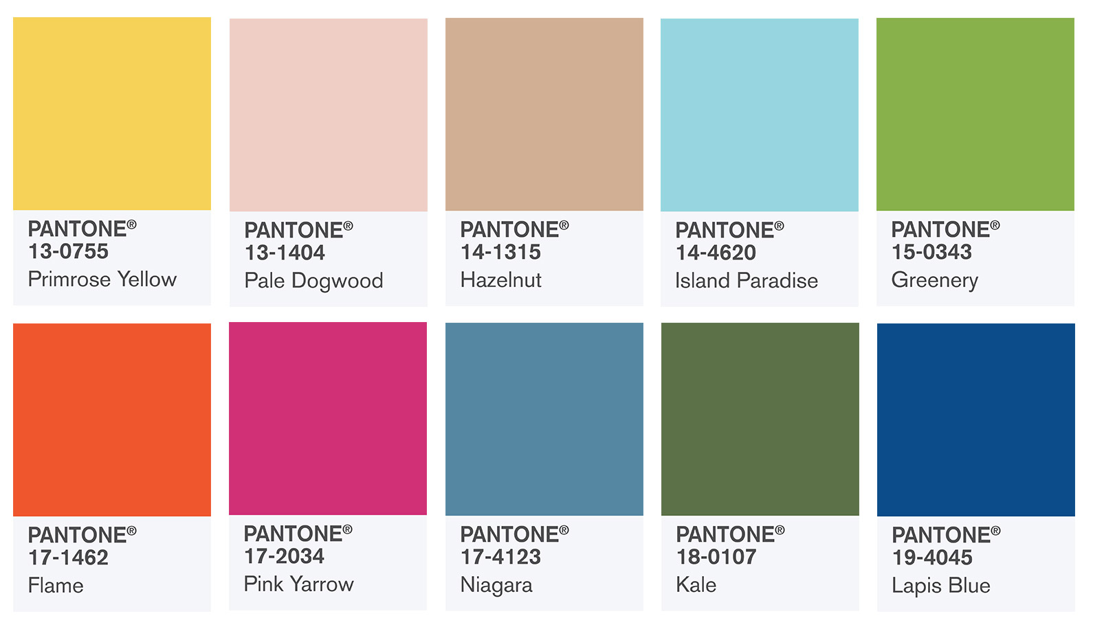
The Pantone’s proposals.
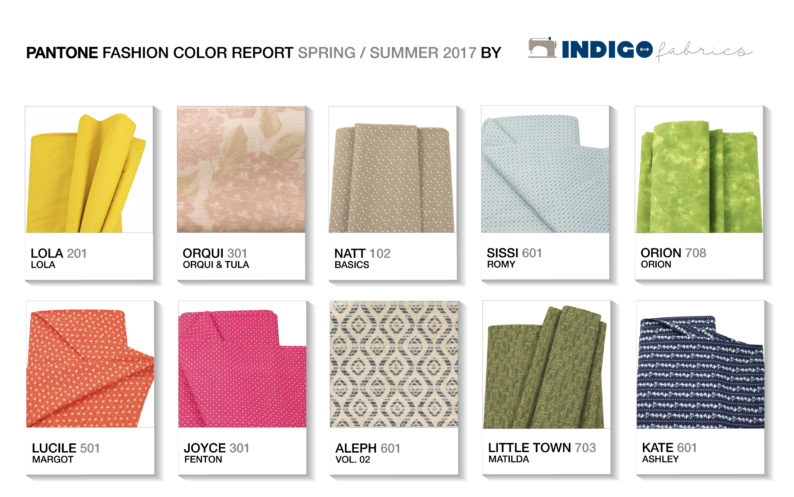
We love color and also fashion. That’s why we’ve made a fabric version of the Pantone’s proposals for coming seasons:
1. The Greens, Greenery & Kale
First of all we find the now famous Greenery which has secured its throne in the middle of the straight of his reign. Sour green color that evokes that passion and vitality of spring days. Our proposal is Mestral 712 of Cotons or Orion 708 from the collection with the same name. On the other hand is Kale, a return to the earth with a calm green that appeals to the roots of the natural. Ecological, practical and nothing flashy. For “conscious” clothing, it is represented by Little Town 703 by Matilda and Gingham 701 from Basics collection.
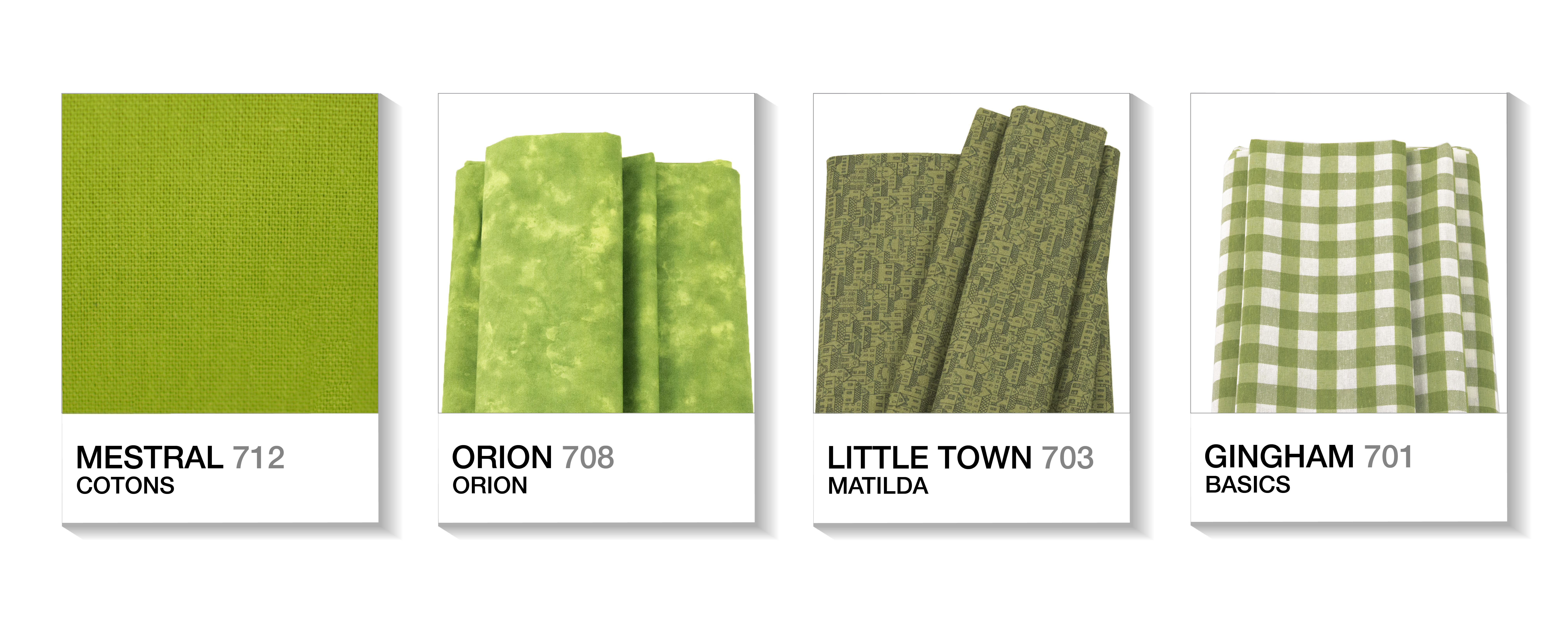
2. The Pinks, Pale Dogwood & Pink Yarrow
Two pinks faced, passion and calm, that coexist perfectly, remember that “opposites poles attract.” Pale Dogwood is that rose that remembers the Quartz, color of the year in 2016. Soft and slow, it left behind its appellation of “girly” to become a tone that inspires serenity, both in fashion and decoration, it doesn’t understand about gender. Our bet is Nancy 301 from Cybill and Orqui 301 from Orqui & Tula.
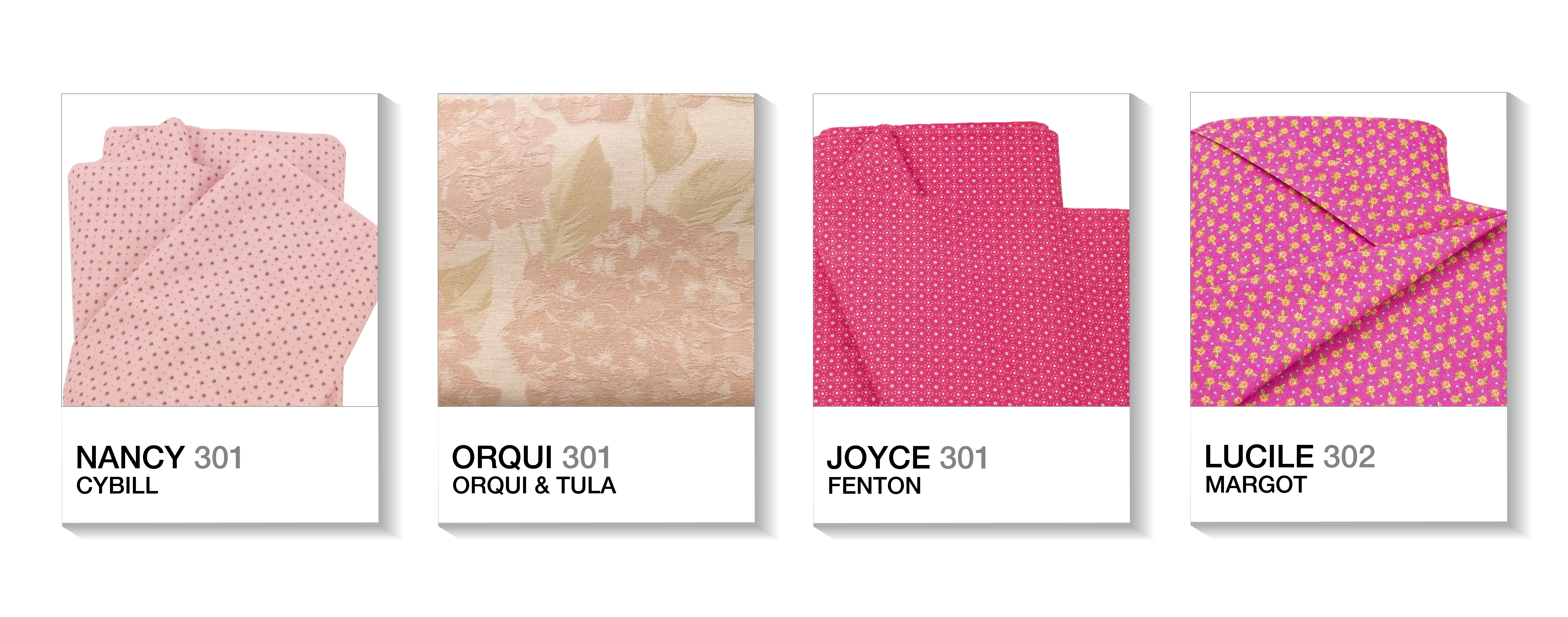
The intense pink, Pink Yarrow, a summer love. A burst of passion, a jumble of vibrant butterflies in the stomach. Like a feeling of extreme happiness, it’s about living the best moment of your life. It’s a fuchsia rose with so much personality that does not need presentation, speechless. Like Fenton’s Joyce 301 or Margot’s Lucile 302.
3. The Yellow, Primrose Yellow
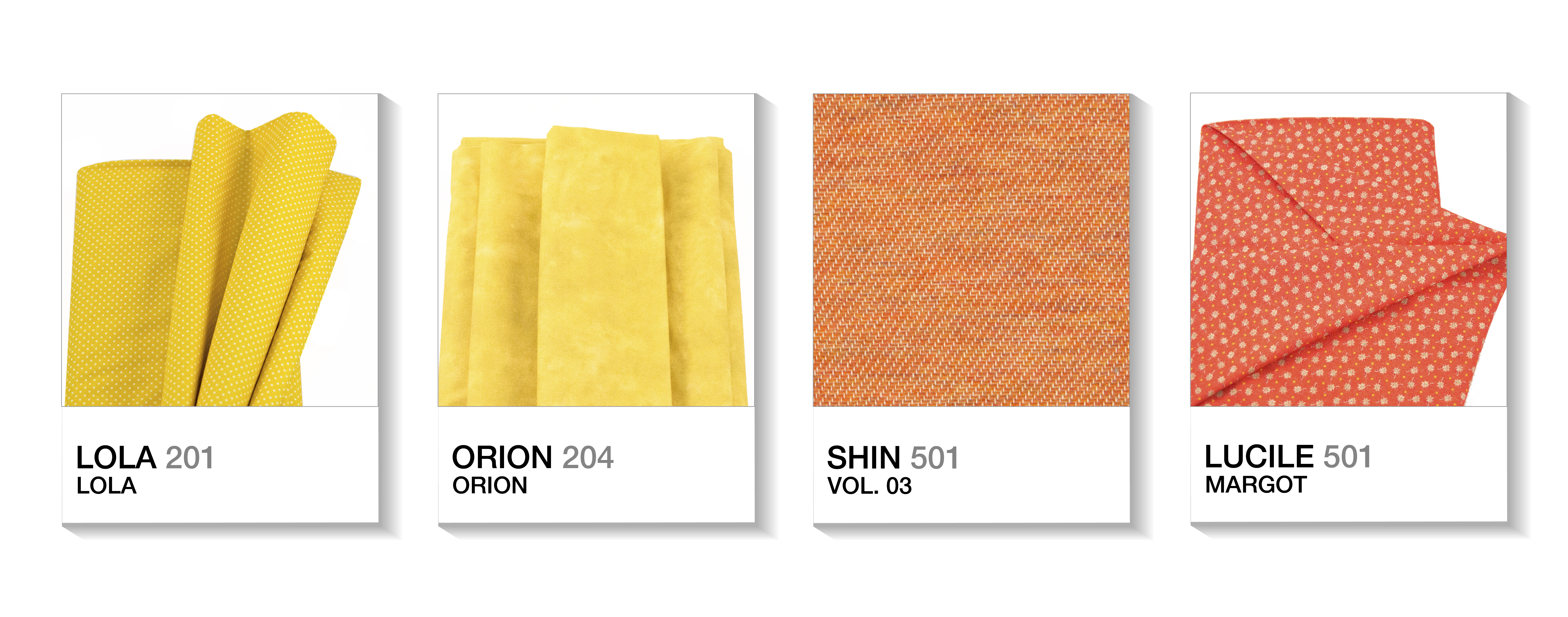
The ray of light in spring and summer. Adaptable, both clear and intense, not a yellow “post-it” or chicken, is yellow “funtastic”. Like Lola 201 (Lola collection) or Orion 204 (Orion collection).
4. The Orange, Flame
The flame of summer love survives in this Flame, a passionate orange, like Shin 501 of the Vol. 03 of Jacquard or Lucile 501 from Margot. Like kisses on the sunsets looking at the sea, because this may be the summer of your life.
5. The Blues: Island Paradise, Lapis Blue & Niagara
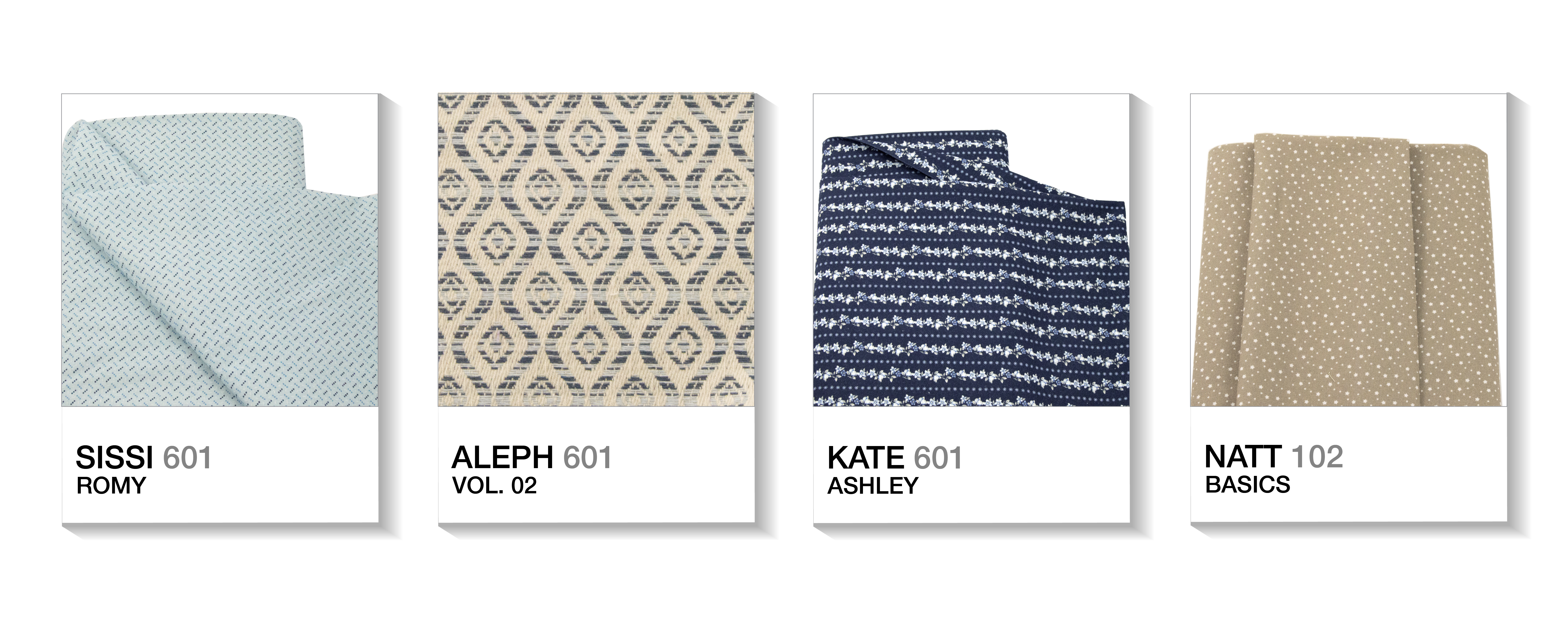
Blues for all tastes. The clearest, Island Paradise, recalls the paradisiacal water from the movie starring Brooke Shields, The Blue Lagoon. It distils summer, it wants salt, sand, and sun. Like our Sissi 601 from Romy.
Pantone’s Niagara, an intense blue, which takes its name from the famous waterfalls, we still do not leave paradise, but with our feet on the ground. Like the Kale, it evokes to ecological mood. Like our Aleph 601 from Jacquard Vol. 02.
Blue in spring and summer can only remind us of water, we arrive at Lapis Blue, the overseas that honors the deep sea but especially the gem so appreciated in jewelry and who takes its name. It’s a sailor color, usual in summer and that shows its best design this season through the stripes. A color only suitable for sea lovers. Our proposal, striped, but at the same time flowered, make way that arrives Kate 601 Ashley.
6. The beige, Hazelnut
A dark beige, hazelnut, like our Natt 102 from Basics. Reminding that seasons pass by and autumn will someday come back. Even so, it’s cozy, warm and with memories to seweet home, “There is no place like home”.
The spanish proverb says that “for tastes, there are colors” and as you see, this spring / summer has a wide variety for all. Now it’s your turn, it’s time to think what to sew, you know: we put the fabric and you the idea.
___________
Did you like this post on the blog? We hope so! We would be very happy, as happy as a flamenco castanets, if you share this publication among your friends on social networks. Thank you! 😉

Leave A Comment